Ridership of Toronto's Bike Share Program and Influence of Surrounding Venues
23 Apr 2019
Reading time ~8 minutes
Bike Share in Toronto
Toronto is the biggest city in Canada with a population of 2.7M in 2016 [1], and it is projected to grow to 3.9M in 2041 [2]. To support such a large population, we not only need the infrastructure but also the transportation to move the population. Currently, bike share is under-utilized as a public transportation option. In this project I will be looking at the usage of Toronto’s bike share program and how they correlate to the venues within the area.
I am not a frequent user of the bike share program, but I do personally see the benefits of bike sharing services. One being that I might need a fast ride to somewhere close without the burden of thinking about where to park my car or bike. I suspect that other users will also perform some kind of cost-benefit analysis that considers the distance traveled and the occasion before deciding to use a bike share. Also, you most likely will not use it for off-road biking or biking through the park. Thus, there may be some correlation between bike share usage and the surrounding venues.
This brings us to believe that the target market for bike share programs is much different from the normal commuter or urban biker. I have not found any research on this segment group, but analysis of bike share usage will shed some light on how to increase efficiencies of docking stations and generate insights on how to better market the program.
When learning about bike share users, we will first consider segmenting ridership and map it alongside clusters of venue density. This will help us determine if certain types of venues will attract higher ridership.
Data Requirements
- Postal regions of Toronto were scrapped from the Wikipedia page [3], with the BeautifulSoup4 package [4]. Using the Geocoder package, this data was merged with latitude and longitude coordinates.

- The Foursqaure API was used to get surrounding venues of a neighborhood and frequencies of types of venues were counted and merged with the list postal regions in Toronto [5].

- 2017 ridership data [6] and station location in latitude and longitude coordinates [7] were available on the City of Toronto Website.

Methodology
Clustering of Postal Regions in Toronto
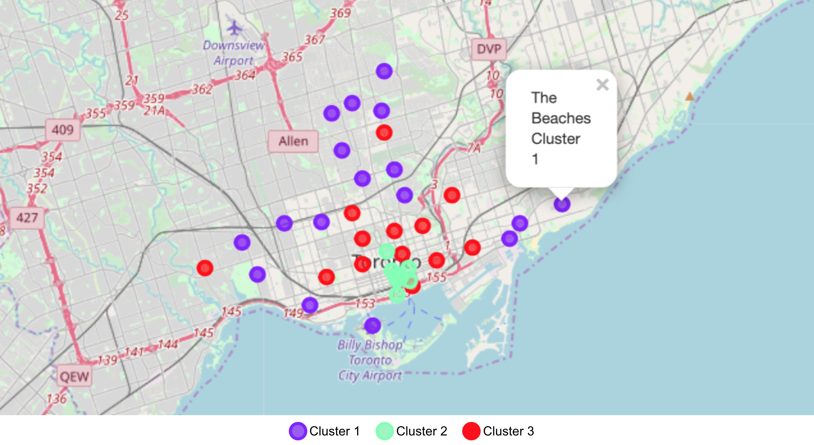
K-means clustering was done on the dataset with the top 10 venues listed. K was tested with k=3 to 7 and it was observed in that k=3 had most intra-group similarities. By looking at the clustering, we can see that there are three main groups: downtown core (green), central Toronto (red) and outer Toronto (purple).

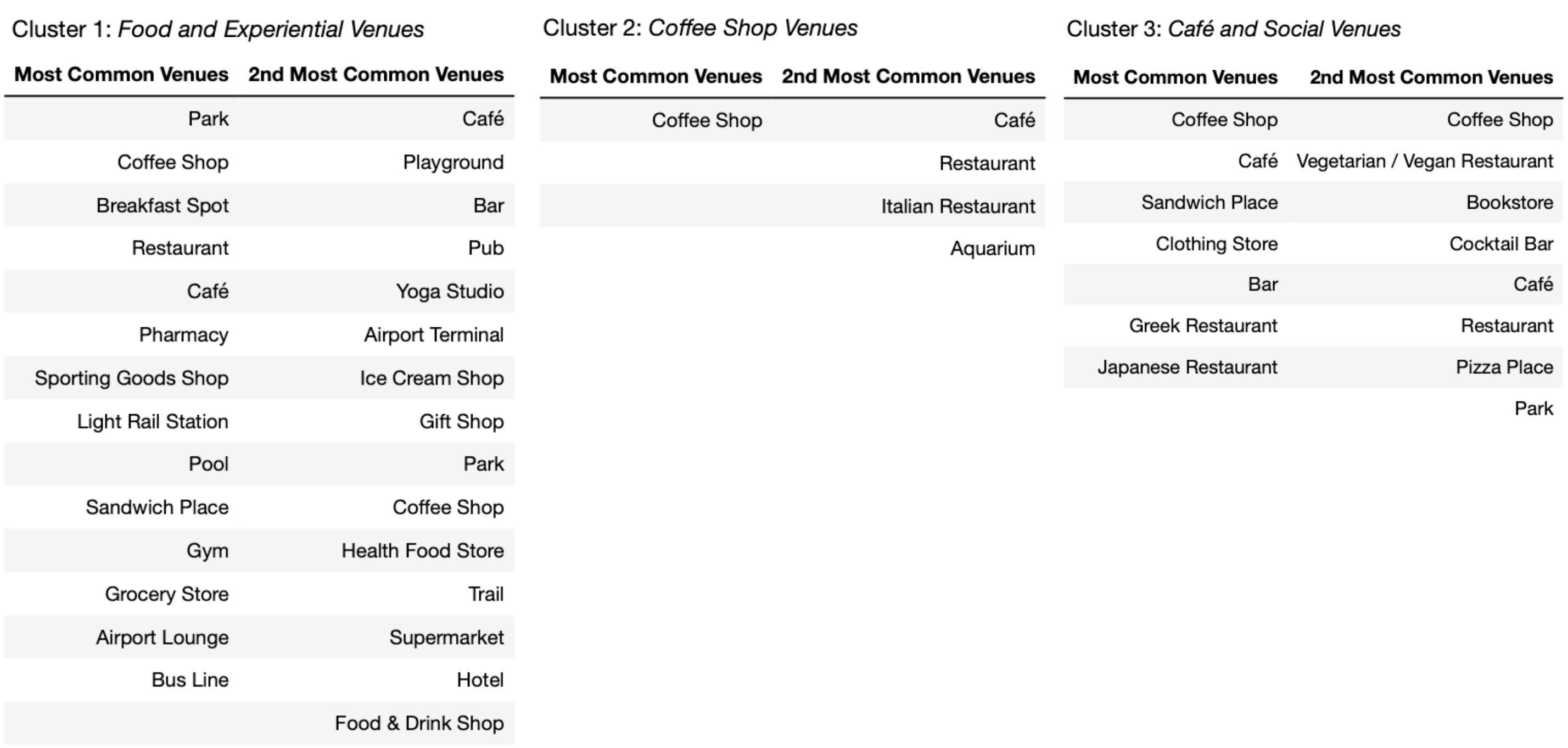
Looking that most common venues within each cluster we are can characterized the clusters based on the types of venues.
- Cluster 1 has wide range of categories in most common venues and 2nd common venue, mostly Food and Experiential Venues.
- Cluster 2 only has coffee shop as the most common venues thus will be labeled as Coffee Shop Venues.
- Cluster 3 has coffee shop, café and bar as the most common venues, and also listed in 2nd most common venues (Café and Social Venues).

Summary Statistics of Ridership
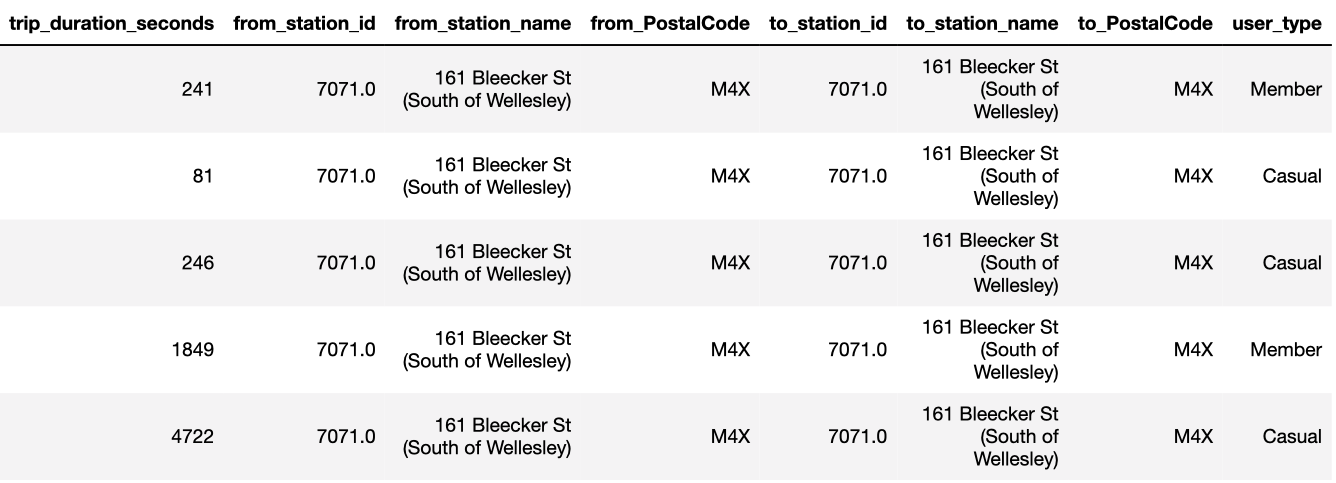
There are 1,116,784 rides in the dataset and they are segmented to tell a better story of how venues within postal regions will attract ridership.
The segments are as follows:
- TOTAL : The entire dataset
- MEMBER : Rides by members of the bike share program
- CASUAL : Rides by non-members of the bike share program
- LOCAL : Rides with in same postal regions (ie. from_PostalCode == to_PostalCode)
- OTHER : Rides outside of the postal regions where the bikes are rented from (ie. from_PostalCode != to_PostalCode)
- ROUND : Roundtrip rides where bike was return back to the station where it was picked up from (ie. from_station_id == to_station_id)
Looking at the summary statistics (table below), I see that casual riders tend to have longer trips, perhaps due to rental requirements for casual riders. Round trip rides are the longest as they might also include the time where the bike is not parked at a station. The destination might not have a nearby station; therefore, the bike must be parked back at the starting station. Most rides start from one postal code region and end up in another.

Based on the segments listed above, I merged the ridership data and the bike station data onto the venue data to see if certain regions attract different types of riders.
The new variables are
- bike_visits: The number of visits in 2017 from riders traveling from a different postal region.
- local_visits: The number of visits in 2017 from riders traveling within the same postal region.
- to_trip_duration: The average duration of rides arriving at this postal region.
- from_trip_duration: The average duration of rides leaving at this postal region.
- station_count: The number of bike share stations within a postal region.

Results
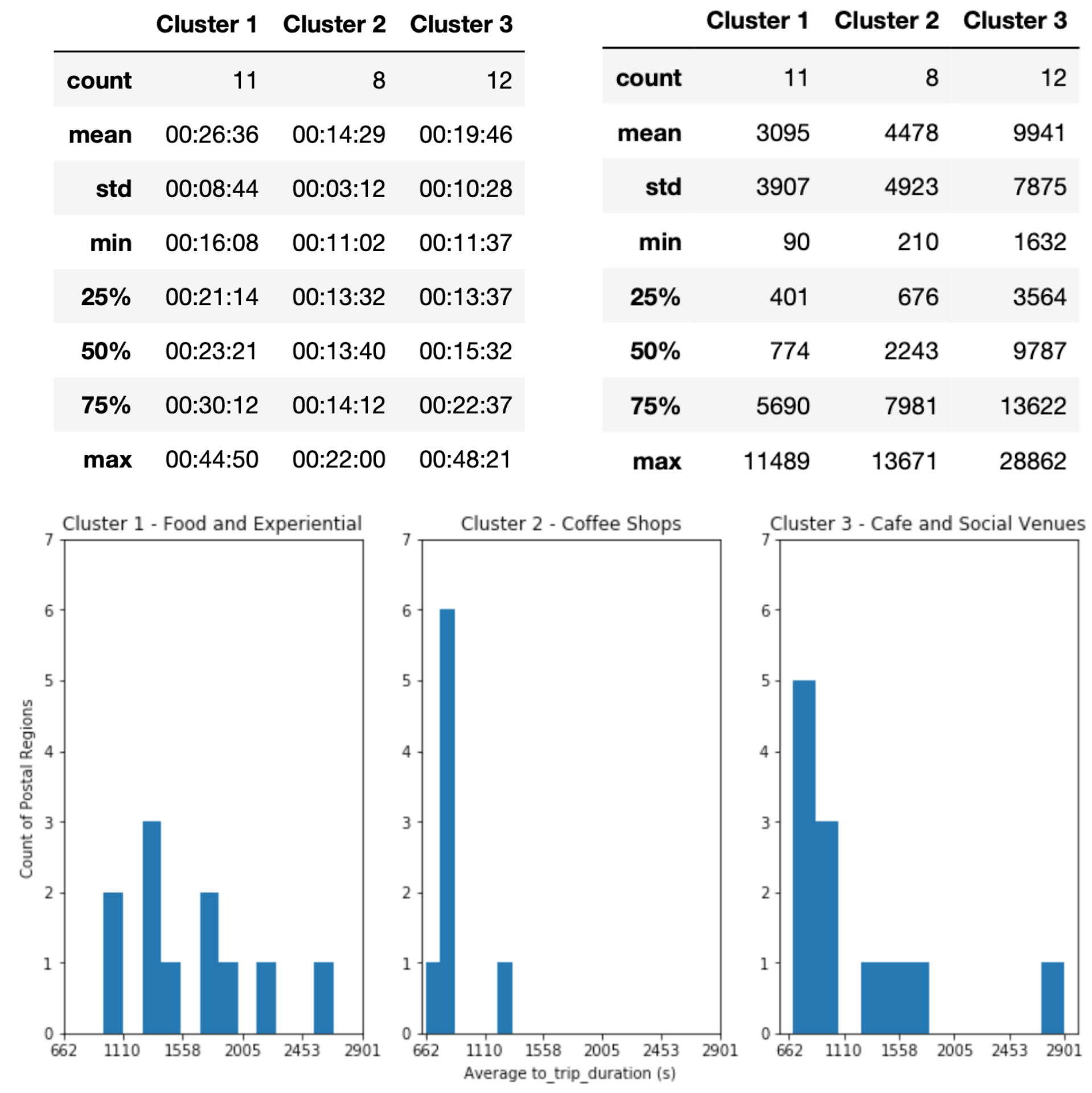
Histograms were plotted for each cluster and ridership were examined to see if there are key difference between clusters. Only relevant graphs are shown to showcase the following key insights.
-
Food and Experiential cluster (Cluster 1) have lowest ridership with a mean of 16K visits in 2017, and the average duration is about 5-10 minutes longer for rides from and going to these areas. Looking at the spatial distribution of cluster 1, they are located on the outer parts of Toronto. Since there might be limited docking stations in surrounding neighborhoods, this can cause ridership to be low and rides to be much longer.
-
In contrast, within Coffee Shop Venues (cluster 2) we can see that the average duration is the shortest (14 mins, 840s) while ridership is very high at an average of 51K rides in 2017. This may be related to the characteristic of areas within this cluster group, areas with more coffee shops tend to be along busy commute routes such as areas surrounding Union station. Looking at the map of Toronto, areas belonging to cluster 2 are closer to Union station and have more than one nearby subway station.
-
Within cluster 3 (Café and Social Venues) rides in the same postal region are double those of other clusters, which suggests that riders are using bike shares to travel to nearby destinations. However, rides to areas outside the cluster area are also high (62K in 2017) which skews the average duration to be a bit longer at 20 mins.

Discussion
Although Toronto is the biggest city in Canada, some may consider it underdeveloped compared to other metropolises around the world. When clustering the 31 postal regions, we were able to see some correlation with the urban sprawl. Initially, I hypothesized that types of venues within an area can attract bike share riders, but the research findings showed that subway stations and Union stations attracted the most ridership from nearby areas.
Additional data from the City of Toronto’s website can be incorporated to account for confounding effects such as total bicycle movements [8] and bikeways (bike lanes, signed bicycle routes, and pathways) [9]. Future studies can include comparing bike share users with everyday bikers or analyzing the correlation with the availability of bike lanes and pathways. Clustering of venues can also include ridership data to consider the traffic in the neighborhood.
The study was limited to the 31 postal regions as that is where bike share docking stations are. Clustering can expand to include other regions to find similar areas for new stations. Considering that the average duration of a trip is 16 minutes and low ridership in cluster 1, new stations should be no further than a 16-minute bike ride away from the nearest existing docking station.
Conclusion
Implications of this study can go beyond management of bike share programs to city planning as the flow traffic is dependent on many factors. One approach is to analyze the differences and similarities of neighborhoods to see how communities in Toronto adjust to the increase in traffic or the increase in population.
As space becomes more limited and growth of transit system is slow, many commuters will consider combinations of transportation based on whichever option is the most efficient. This research proves the case that transportation organizations should work together to find a solution that is different from the traditional way of thinking. One good example is the Presto card system, which made it easier for commuters to transfer in between the GO and the TTC [10].
Reference
- Statistics Canada - 2016 Census Results
- Ontario Ministry of Finance - Ontario Population Projection Update
- Wikipedia - List of Postal Codes of Canada:M
- BeautifulSoup Package
- FourSquare - API
- City of Toronto - Bike Share Toronto Ridership Data
- City of Toronto - Bike Share Toronto
- City of Toronto - Bicycle Counts
- City of Toronto - Bikeeway
- PRESTO Card Program